Google Announces Pixel 3a & Pixel 3a XL: Mid-Range Phones With Flagship Camera
by Andrei Frumusanu on May 7, 2019 2:30 PM EST- Posted in
- Mobile
- Smartphones
- Pixel 3a
- Pixel 3a XL

Google’s Pixel smartphone line-up has been a mainstay of the industry for a few years now. We’re all familiar with devices such as the latest Pixel 3 which is Google’s latest entry in the high-end flagship market. In particular Google puts a lot of emphasis on the cameras of the Pixel devices, and last year in particular, Google, along with Huawei, have raised the bar in terms of what is possible to achieve thanks to computational photography.
While the Pixel devices definitely have their strengths, one inarguable competitive weakness of the phones is their pricing. At an official MSRP and current Google store price of $799 for the Pixel 3 and $899 for the 3 XL, Google demands quite a lot, especially in view of other newer possibly more attractive options from the competition.
In an attempt to widen its product range and adhere to a more price-sensitive audience, today we see the introduction of the new Pixel 3a and Pixel 3a XL. The two new phones are very much placed at more mid-range price-points, yet without compromising much on what Google sees as the keystone of the Pixel phones: the camera.
Going over the specifications of the two new phones:
| Google Pixel 3a's | ||||
| Pixel 3a | Pixel 3a XL | |||
| SoC | Snapdragon 670 2x Kryo 360 (CA75) @ 2.0GHz 6x Kryo 360 (CA55) @ 1.7GHz Adreno 615 |
|||
| DRAM | 4GB LPDDR4X | |||
| Display | 5.6" OLED 2220 x 1080 (18:9) |
6.0" OLED 2220 x 1080 (18:9) |
||
| Size | Height | 151.3 mm | 160.1 mm | |
| Width | 70.1 mm | 76.1 mm | ||
| Depth | 8.2 mm | 8.2 mm | ||
| Weight | 147 grams | 167 grams | ||
| Battery Capacity | 3000mAh | 3700mAh | ||
| Wireless Charging | - | |||
| Rear Cameras | ||||
| Main | 12.2MP 1.4µm Dual Pixel PDAF f/1.8 76° lens with OIS |
|||
| Telephoto | - | |||
| Wide | - | |||
| Extra | - | |||
| Front Camera | 8MP 1.12µm f/2.2 84° lens; fixed focus |
|||
| Storage | 64GB eMMC | |||
| I/O | USB-C 3.5mm headphone jack |
|||
| Wireless (local) | 802.11ac Wave 2 Wi-Fi Bluetooth 5.0 LE + NFC |
|||
| Cellular | UE Category 11 (DL) / Category 5 (UL) 600Mbit/s DL (3xCA 2x2 MIMO) 75Mbit/s UL |
|||
| Other Features | Dual Speakers, 18W Fast Charging | |||
| Dual-SIM | 1x nanoSIM | |||
| Launch Price | $399 / £399 / €399 | $479 / £469 / €479 | ||
At the heart of both phones we find a new Snapdragon 670 SoC from Qualcomm. The chip was announced last August and comes with a 2+6 CPU core configuration consisting of 2 Cortex A75 cores at 2GHz and 6 Cortex A55 cores at 1.7GHz, accompanied by an Adreno 615 GPU. The chip is manufactured on Samsung’s 10LPP process node.
It’s actually quite odd to see Google go with the Snapdragon 670, given that Qualcomm offers a slew of other newer options such as the Snapdragon 675. Here it’s possible that the Pixel 3a phones just come at an odd timing between generations and weren’t able to employ the newer SoC.
Google fits the Pixel 3a’s with 4GB of LPDDR4X, which is a fair for mid-range devices. In terms of storage, the devices comes with a single 64GB option, without expandable storage. Don't expect the phones' storage performance to be especially high either, as Google is using legacy eMMC here instead of UFS.
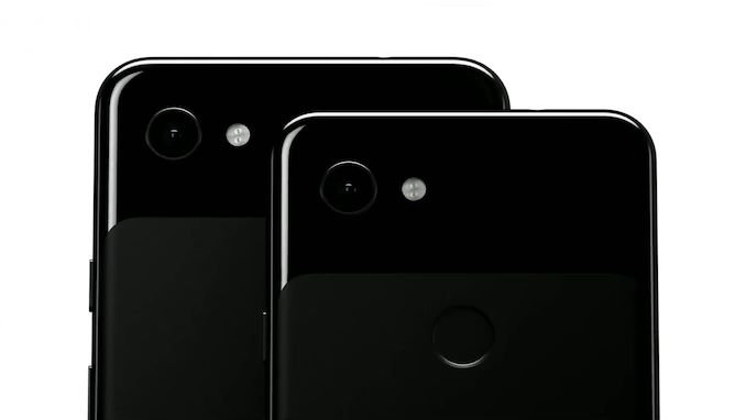
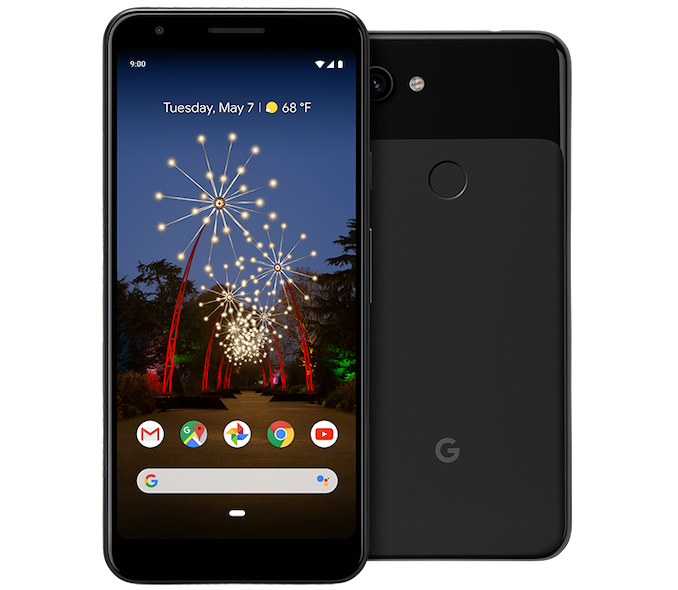
Design-wise, both phones looks night identical to the smaller Pixel 3, using the same design language and characteristic features. It’s interesting that for the bigger Pixel 3a XL, Google also opted to use the notch-less design, avoiding this much critiqued aspect of the Pixel 3 XL.
Both phones continue to employ OLED panels. The smaller Pixel 3a comes with a 5.6” 18:9 screen with a resolution of 2220 x 1080. The larger 3a XL has a 6.0” screen with the same resolution.
Instead of using a glass back like on the Pixel 3 series, the new Pixel 3a’s come with unibody polycarbonate designs. On one hand, this reduces the weight of the phones, with the Pixel 3a coming in at 147g and the XL at 167g, but also should result in a more scratch prone phone.
Battery capacity for the smaller 3a is 3000mAh while the XL gets a notably larger 3700mAh battery. The phone supports 18W charging, however one of the axed features looks to be wireless charging as the new phone are lacking it.
Even though Google removed the port 2 years ago in the Pixel 2, the new Pixel 3a sees the return of the 3.5mm headphone jack. We live in quite the weird world today where vendors decide that removing a feature on the more premium models is something the consumers should want, but at least it’s all good for the Pixel 3a’s.
Google continues to employ dual front facing speakers with stereo playback capability.
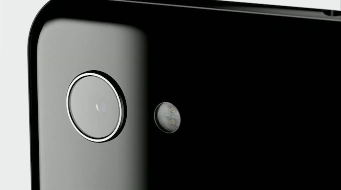
An important aspect of the Pixel 3a’s is their cameras: Inherently, the single rear module is exactly the same as found on the Pixel 3, meaning the Pixel 3a should have the same imagining capability as its higher end sibling. The 12.2MP sensor has 1.4µm pixel pitches and employs full sensor dual pixel PDAF, with the optics being an f/1.8 lens with a 76° viewing angle and keeps the OIS mechanism – something that is quite rare in mid-range devices.
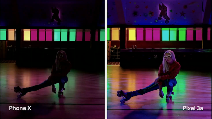
One thing that isn’t clear is if the Pixel 3a’s employ Google Visual Core. Inherently there shouldn’t be need for it for the mid-range phone to have the same photography features as its higher end sibling as computation can be picked up by the Snapdragon’s DSP cores – although they might be slower at the task. Indeed Google continues to promise the same key features as on the high-end model, including Night Sight and Portrait Mode.
The Pixel 3a comes in “Just Black”, “Clearly White” and “Purple-ish” for $399, while the Pixel 3a XL comes in at $479. In the US, the device will premier not only on Verizon, but also T-Mobile, Sprint and US Cellular, alongside the Google Store in various other countries.


72 Comments
View All Comments
jjj - Tuesday, May 7, 2019 - link
I've heard about those, phones in the old days used to have them,, they are called bezels!Cool that Google went retro, likely that's why prices are so very high.
BedfordTim - Tuesday, May 7, 2019 - link
I was all excited about the smaller screen until I saw the bigger bezels.pixelstuff - Tuesday, May 7, 2019 - link
Bezels are good and it's why most photo frames include them. They help separate the image from the background.jensend - Tuesday, May 7, 2019 - link
During the earliest smartphone generations, reducing the bezel space was a worthy goal because it actually improved the user experience. But for the last four years it's been apparent that the "OMG must have no bezels" drive no longer has anything to do with user experience and is just for satisfying the snob influencer groupthink. I'm not bothered by the existence of a notch on my phone, but I am bothered that manufacturers prioritized gimmicky ways of trying to minimize bezels over actually doing anything about battery life or camera image noise.Similar trends of fashionable bullcrap seem to dominate much smartphone 'innovation.' Essentially, nobody really benefits from having a 4K screen, 8+GB of memory, and 512GB of built-in space. Human-sized eyes and hands and ears and pockets are disadvantaged by having phones with a flipping 7" diagonal. And it's outrageous that we're talking about a $479 phone as "midrange" and that we hear of $299 phones being called "budget."
I guess the problem is that idiots with money to blow for vanity purposes are more likely to be buying a new phone every year than are people who just need a functional and reliable tool.
Megatomic - Wednesday, May 8, 2019 - link
Agreed. I'd so much rather have a bezel than a notch or a gimmicky camera arrangement. If Google made a Pixel 4 that looked just like my Pixel 2 XL I'd be perfectly happy.philehidiot - Thursday, May 9, 2019 - link
I have an S8. The bezels at the top and bottom are a little ugly compared to newer phones but when you realise that on the S10 you lose the iris scanner and go back to very poor facial recognition, it's a trade off I'm more than happy to make. My biggest issue is the "edge" screen. It makes accidental presses too easy, makes holding it properly hard. So you put it in a case which makes it hard to touch the edge parts and use certain swipe gestures. I prefer bezels to a stupid hole in the screen for a camera. The notch didn't annoy me too much as you could pop time and notifications either side. Frankly, just keep a damned bezel.I think the main problem is that the majority of buyers go to a shop and choose a new phone and so that immediate in hand feel and looks make a massive difference. To people like us, who read Anandtech reviews and compare spec sheets and care deeply that UFS is being shunned for eMMC, these things get weighed up carefully. For most people (let's call them.... normies) these small design features which are form over function make a big difference as to whether they choose to buy a particular phone.
nikon133 - Sunday, May 12, 2019 - link
I'd be perfectly happy with these base specs... have they included SD card slot (or, maybe, just offered 128GB version as well) and, say, wireless charging. Wireless charging is somewhat personal choice, but I have been used to it since Lumia 920. Storage... for phone with great camera and 3.5mm jack, it comes natural that many users will use it as music player and shoot a lot of stills and videos... media files = storage. Not that 64GB is completely useless, but I'd feel better with more.piroroadkill - Wednesday, May 8, 2019 - link
Yeah. 5.6" almost seems reasonable today.. but no, the phone is still huge. S10e is the phone I've been eyeing up most these days.Spoelie - Wednesday, May 8, 2019 - link
S10e 142.2 x 69.9 x 7.9 mmP3a 151.3 x 70.1 x 8.2 mm
They are nigh the same size, the 9mm height is primarily split between top and bottom bezels - while visually less appealing, actually might help usability.
BedfordTim - Wednesday, May 8, 2019 - link
If you want a small phone then that 1cm is significant.