The Apple Watch Review
by Joshua Ho & Brandon Chester on July 20, 2015 8:00 AM EST- Posted in
- Wearables
- Apple
- Mobile
- Apple Watch
WatchOS: Time and Notifications
Ultimately, Apple Watch is a first generation product. As a result, details like the CPU, GPU, and RAM configurations are of secondary importance to software. Choices made early in the growth of a platform can have far-reaching consequences that will remain many years after the original hardware has long been obsolete. Android still uses the sdcard convention for user storage, even though many modern Android smartphones place the sdcard partition on internal storage as early Android smartphones strongly relied on microSD cards for user storage. iOS generally sees more issues with aspect ratio and density transitions than Android due to choices in UI rendering architecture, which were determined with the original iPhone. As a result, Watch OS 1 has to be a solid base for future growth, even if future iterations of Watch OS end up nothing like the original Watch OS.
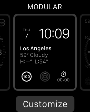
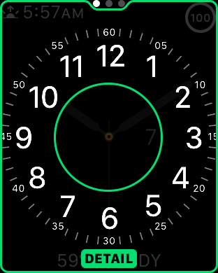
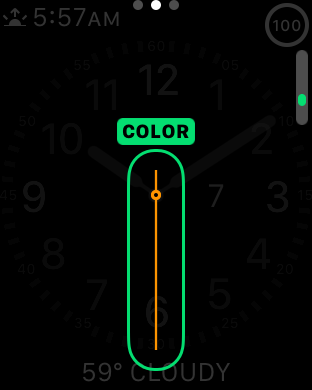
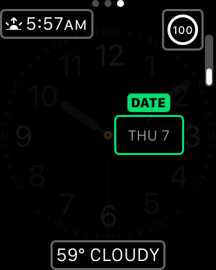
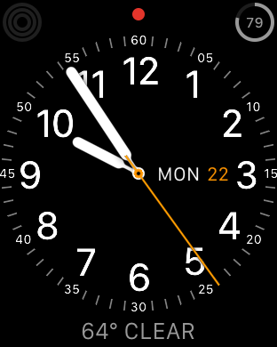
Probably the first area worth discussing are watchfaces. One of the first things that became apparent to me in my experiences with Watch OS was that watchfaces have a great amount of depth when it comes to interactivity and customization. On other wearable platforms there are definitely applications that allow a pretty decent level of watchface customization in terms of appearance, but the equivalent of complications in Watch OS is usually missing to some extent. You might be able to see the weather, but you usually can’t display something else like battery percentage, sunset, calendar events, moon phases, activity progress, stocks, or any other information that you might be interested in seeing at a glance. It’s also possible to change the amount of detail you get when displaying the watch and use the digital crown to adjust the detail present analog faces. For example, the chronograph watchface allows you set 60, 30, 6, and 3 seconds for the timer. Other analog faces make it possible to set hours, minutes, and seconds of precision on the display. This might be a bit boring, but the included watchfaces show a solid framework for future growth.
It is a bit disappointing to see that there isn’t support for third party watchfaces out of the gate, but I suspect this is more due to a need to work out exactly what is needed for the API and the need to commit to long term support for any public-facing API. By comparison, it goes without saying that whatever private APIs Apple is using to enable the first-party watchfaces are subject to change at any time, which allows for significant latitude in how watchfaces are implemented.
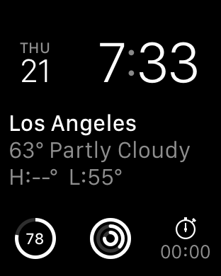
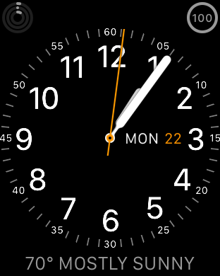
Overall, the included watchfaces are also well-designed. It isn’t really possible to show with video, but the animations that are included are impressively executed. On analog watchfaces, the second hand moves smoothly with no apparent stutter, which is a nice touch even if this isn’t all that difficult for a general purpose computer with a display that can refresh at incredibly high rates as I’ve seen more than one smartwatch that will only update the second hand every second rather than in a seemingly continuous manner. I personally ended up using the modular watchface most of the time, which doesn’t have any analog motion, but something as simple as the breathing second indicator is subtle and well-executed.
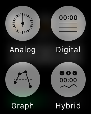
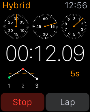
Given that Apple Watch is supposed to be a timepiece first, there are other aspects of the watch worth discussing like the timer, alarm, and stopwatch UIs. Although this is seemingly small stuff, it’s really worth calling out the timer and alarm UIs as the best example of how the combined touch and digital crown navigation works in practice. There are large touch targets to select hours and minutes, and the digital crown allows for fast and precise selection within hours or minutes. The stopwatch UI is a great demo of Force Touch in action, as it’s possible to go from a simple analog or digital interface to a hybrid one, with a live graph of relative lap times instead of just a list of previous laptimes.
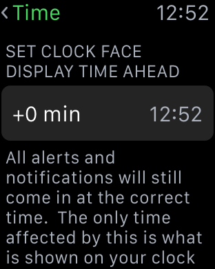
This is all really rather boring when you take a step back and realize that I’ve been talking about three of the most boring and bog-standard applications on any smartphone today, but when it comes to a first generation smartwatch it’s critical to get these applications done right. Of course, it goes without saying that alarms and timers work incredibly well on the Apple Watch due to the haptic feedback that is occurring on my wrist. Overall, on these simple aspects it's already pretty clear that Apple has put a pretty significant amount of thought into WatchOS. Probably the most obvious example of this is the ability to set the clock to be a set number minutes ahead, which is something that really shows attention to detail on Apple's part.

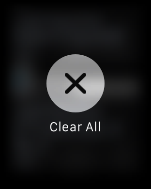
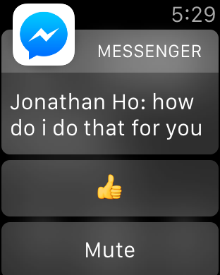
Outside of watchfaces, the next most important aspect of the Apple Watch is probably the notification system. When purely focused on the actual notification shade, the design doesn’t have any obvious flaws. If there are notifications in the drawer, a red dot appears on centered on the top of the display. Swiping down from the watchface opens up the notification drawer, with the ability to scroll through notifications with the digital crown and dismiss all notifications by using Force Touch providing a smooth and quick experience, although if you’re like me you might not realize that you can use Force Touch to dismiss all notifications for some time. However, in my experience with Watch OS 1 the experience is pretty bimodal when it comes to how useful these notifications are. The first case usually involves the ideal experience, which is an actionable notification that I can respond to on my wrist and dismiss after responding to it without ever taking out the phone to respond to the notification. Multiple simultaneous notifications are handled smoothly and logically. This is usually what happens with simple text messages/iMessage and other first-party applications.


The second case is usually what happens with third party applications, which tends to be a combination of poor handling of multiple notifications and no real actions that can be taken. Pretty much any third party IM client suffers from these issues right now, and probably the biggest source of notifications on my phone comes from third party IM clients. As a result, it’s really quite irritating to raise my wrist and see nothing but the application icon and a message saying that I have two notifications. In order to appropriately respond to this, the only solution at this time is for me to take out my phone, unlock it, and then read and type out my response on the phone. Alternatively, I have to dismiss the notification, then go back to the notification drawer and go through each notification separately.

To me, this represents a pretty significant issue that pretty much every wearable platform has right now, which is that there are often corner cases where wearables end up using more time than just using a smartphone alone. In the near term, I suspect the quickest solution to this issue is turning multiple notifications arriving simultaneously into a scrollable list instead of simply notifying that there are multiple notifications. It would also be helpful to be able to respond to notifications using dictation on the watch to draft a response, but I suspect that this requires additional work on the part of the developer to enable such things.


270 Comments
View All Comments
TedKord - Monday, July 27, 2015 - link
Holy crap. That post was longer than the review.Figaro56 - Saturday, August 1, 2015 - link
Holly crap you sound exactly like a manic depressive friend of mine. You lost me at the gazillionth POS comment.michellepennie - Wednesday, August 26, 2015 - link
Boohoo you sound the jealous type and i bet you couldn't afford one :P loldsumanik - Monday, July 20, 2015 - link
You know what Ryan, I'll give you the benefit of the doubt.Whether it was apple PR or not is irrelevant. I'll even admit I didn't even finish the entire article because it read like a kid getting a new toy for christmas explaining how magical it was.
Can you explain to my why the author(s) felt the need to photograph and post not one, not two, not three, not four but FIVE neatly arranged unboxing shots... on the very first page of the article.
The shots were deliberately arranged on a cleaned, attractive, ironed cloth that tied into the watch's color scheme.
Some questions about the opening sequence of photos :
- Do you think that these shots reveal any info to your readers? Tech specs, warranty info, durability?
- Why does the EXIF info read adoble lightroom. Like gimme a break. They were enhanced.
- If we remove all verbiage, does the watch look attractive, or unattractive in any way shape or form?
- Do people generally wear a timepiece nicely draped over their fingers in front of a sunny picturesque tree?
- Is it just a coincidence that not only I but others, thought the photo's looked 'funny'?
The author(s) deliberately took time and significant effort to make the product to look as attractive as possible. The opening page, it's photographs and presentation instantly clue the reader that this piece is obviously written with heavy marketing bias and the overall tone and conclusion will be a positive one.
Is my original post inflammatory? Sure. Beligerent? yes.
100% True?
YES.
You know why this watch isn't selling? Apple's customers are thinking this:
"Cool! New apple watch! What does it do?"
"Hmm, it doesnt really do that much. I was kind of expecting more."
"You know what, it's kinda chunky and why does it stutter?...OMG, 400 bucks? pffff totally not worth it."
I know this because I am an apple customer, and this thing pretty much just sucks.
Some more questions:
- Do you think it would be good for your publication to write a scathing review of an apple product that went viral? Isn't that kind of sad?
- Would you recommend this product for a single mother, your grandma, or anyone else close to you?
- Have you thought about purchasing this product for ANYONE as a gift?
- Had this review not taken place would you have gone out and purchased this item for yourself? LOL!!!!
- Can you link me an article written on anandtech that portrayed any apple product in a negative light, ever?
I'm sorry RyanI know you are jsut doing your job but the 'general consumer' is getting smarter and the internet is getting clogged up with this kind editorial crap.
The only way to stop it is to speak up, LOUD, and be heard.
Didn't Ellen Pao just say it best?
"The trolls are winning"
By trolls, she meant the general public tha ist sick of being lied to and manipulated.
Lied to by presidents, company reps, journalists, law enforcement, intelligence agencies....right down to silly little amazon reviews.
2 weeks later he files a patent to provide an advertisement based on your bank account balance!
Call a turd a turd.
Dont photoshop it then, sprinkle whipcream and cherries on top.
Just sayin.
Ryan Smith - Monday, July 20, 2015 - link
"You know what Ryan, I'll give you the benefit of the doubt."Thank you. I appreciate it.
"Whether it was apple PR or not is irrelevant. I'll even admit I didn't even finish the entire article because it read like a kid getting a new toy for christmas explaining how magical it was.
Can you explain to my why the author(s) felt the need to photograph and post not one, not two, not three, not four but FIVE neatly arranged unboxing shots... on the very first page of the article."
The short answer is that our Apple reviews have a wider reach than our standard technical articles. The range of readers that will show up to AnandTech for a MacBook or iPhone review has a much more distinctive consumer shift than say an SSD or CPU review. And while we still have a large number of technical readers (who are our heart and soul), it's also good for us to be visible to less technical consumers, as it helps them learn that we exist and, hopefully, come back to learn things that no other site can offer.
In any case, when you're working to reach a broader audience, you need to focus on more than just words. Less technical consumers aren't going to care about the S1 analysis for example, and that's okay, because we reach these users in other ways. And one of the ways we do that is in photography. Broader audiences like pictures - they like good pictures - and that means we step up our game on photography for these reviews in order to accommodate those users. There are a number of other sites out there reviewing the Watch, and there is a segment of the broader audience that will write us off in favor of another review if we show up with poor photography, so we need to make sure that not only is our analysis top notch, but our prose and imagery is competitive as well.
At the end of the day we won't make any compromises on the technical side for our regular technical readers, but if we can also bring wider consumers into the fold through materials such as improved photography, we will do that as well. This way both techies and non-techies alike can enjoy our articles and learn something from them.
mapesdhs - Tuesday, July 21, 2015 - link
Irony is, if the photos were 'poor', someone would be complaining about that instead. Ya can't please all of the people all of the time...Ian.
Schickenipple - Tuesday, July 21, 2015 - link
It's sad, Ryan, that you actually had to explain this to someone. I thought your core readers would understand that an Apple Watch review isn't in the same category as a NVMe PCIe SSD. Guess not.bo3bber - Saturday, July 25, 2015 - link
Ryan, just wanted to observe that this approach has had the opposite effect on me. I used to come to AnandTech as my absolute goto first tech site, and these Apple puff pieces made me question your other reviews. So instead of improving your reach, at least for me, you reduced your reach because I feel that I cannot trust you as much as I did.The fact that Anand himself also left to go to Apple would strongly suggest you be wary of running Apple stuff that is fluffy.
I only read the summary, because the out-of-box first page showed me it was going to be a puff piece not a technical review.
I think you do yourself a disservice and have damaged your brand by trying to reach a larger market.
Samus - Tuesday, July 21, 2015 - link
They clearly haven't paid attention to the high production value of ALL Anandtech articles over the past decade. You guys use top notch photography and lightboxes all the time. These comments are ridiculous.The Reddit fallout must have sent trolls to every corner of the internet.
victorson - Wednesday, July 22, 2015 - link
Ryan, I do respect Anandtech coverage a lot and Josh has done some great research articles that I'm still digesting. However, I have to agree with others: this review just reads strangely lacking in perspective. It is choke-full of weird claims about watchOS being the iOS in the watch world, and about all that first-gen BS that gets throw around. Why is it that every tech reviewer would gladly slam a device for its poor functionality, but once we start talking about Apple, suddenly you guys chicken out and rather than saying that it's shit, you say that 'well, it lags like hell, but that's okay, because it's a first gen product.' And how about commenting on the lack of any actual useful functionality on the watch that would make users spend a ludicrous $700 for a single-core 500MHz processor running a 1.5" display? Don't get me started on forgetting to mention that other competitors have always-on screen (the WatchOS is a sore disappointment) AND come with two days of battery life. AND half the price! But no, rather than giving us some insightful comments on that, we get the 'I'm definitely convinced in the smartwatch now'. Thanks, very useful! /s