Filling the Gap: AMOLED and LCD from 2010 to 2012
by Joshua Ho on July 26, 2014 6:00 AM EST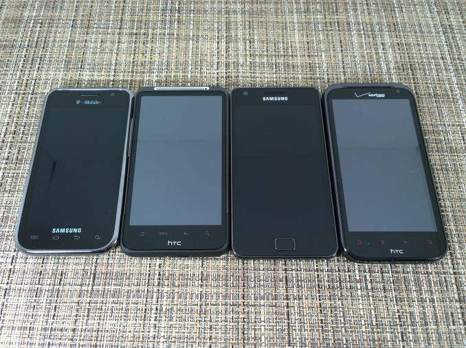
Introduction
For a while now, I’ve realized that there is a massive gap in the continuity of smartphone display history. Until the last few months of 2011 or early 2012, proper testing of smartphone displays was few and far between. Most websites tested peak brightness and contrast, and possibly white point. While some websites did go in depth, they would often only test a few phones. Of course, now things are different. Websites are starting to scrutinize display quality from all angles from color accuracy to reflectance, but no one has ever gone back to properly test old devices.
Of course, the best time to have tested these old devices was when they were new. The next best time is now, so let’s get to it. Unfortunately in the span of 4 years it’s become rather difficult to find all the devices that I’d like, but we’ll look at some of the key representative devices of each generation. This means the Galaxy S, Desire HD, Galaxy S2, and Rezound. The first three are all WVGA, 800x480 resolution displays. The Galaxy S has a 4 inch display, and all the other devices have a 4.3” display. All of them are also easily used with one hand, which is almost a surprise these days. Unfortunately, battery life testing won't be possible as all of the devices have aged too much for the results to be representative of their actual performance. As always, in order to properly test displays we use a custom workflow on SpectraCal's CalMAN 5.
Samsung Galaxy S
For most people, the Galaxy S would be their first encounter with Samsung’s SAMOLED displays and PenTile layouts. While it may have been acceptable at some point in the past, it’s quite obvious that this display hasn’t aged well at all. While high pixel density masks the effects of PenTile quite well, they’re omnipresent in the original Galaxy S. Even at relatively far distances from the display I can make out gaps between pixels in text. At the edges, there’s a strange effect where the lines are clearly not straight. Instead, the edges of text appear to be quite rough, making a zig zag pattern instead of a clean line.
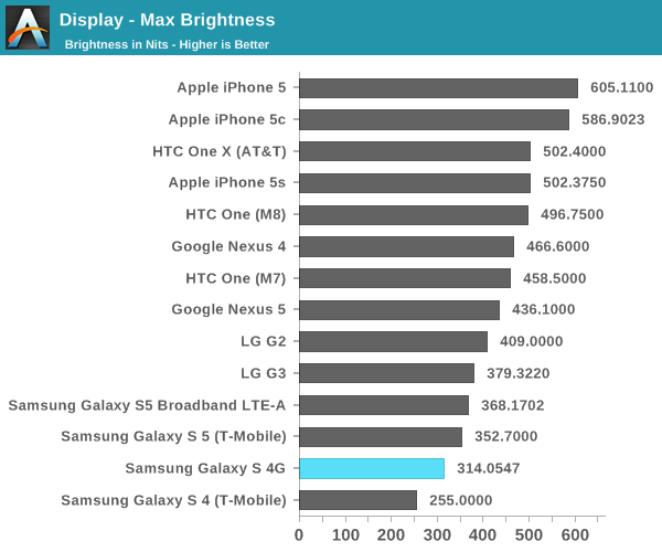
Putting aside PenTile, the brightness of this display has aged relatively well. The expected brightness seems to be about 350 nits out of the box, and the T-Mobile unit I tested seemed to have lost some of its peak brightness, but it’s still quite bright at around 320 nits. Contrast is great as always here.
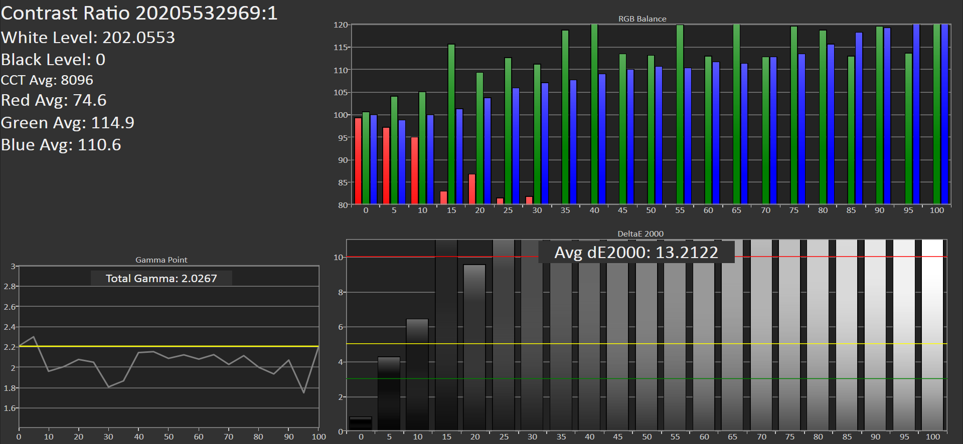
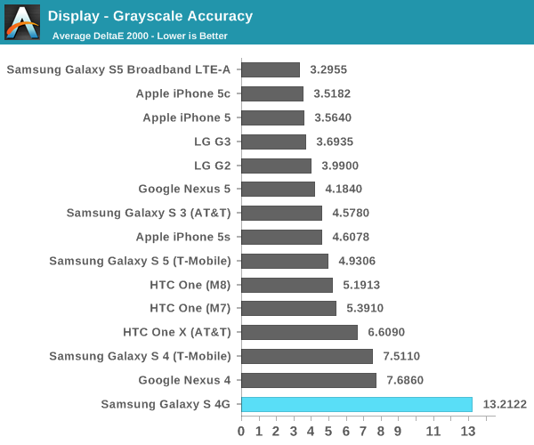
Grayscale is where things get ugly. Red is effectively no longer visible in the graph by 35% white, and both green and blue are completely out of control. The result is one of the worst averages for dE2000 error I’ve ever recorded.

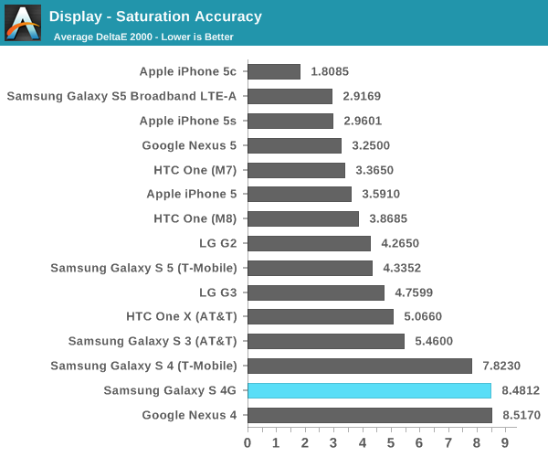
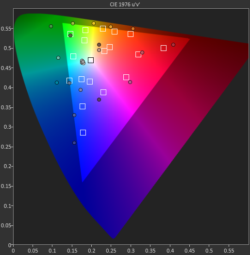
In the saturation sweep, we see a similar story. Just about every type of mistake in color accuracy is seen here. Extreme blue/green shift on white, saturation compression, gamut far out of sRGB, hue shifts with saturation changes, and no way to improve it.
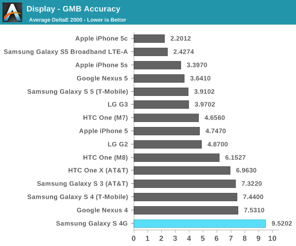
As expected, a similar result is seen in the Gretag Macbeth ColorChecker. This is simply a logical extension of poor color control in the saturations test, so this is no surprise. Looking at the Galaxy S5 LTE-A, it’s definitely incredible to see just how far Samsung has come since the early days of AMOLED technology.


72 Comments
View All Comments
name99 - Saturday, July 26, 2014 - link
This is a silly statement. As I said, the 4 feels substantially slower than the 5. WiFi is not nearly as fast as I'd like. Hell, the 4 doesn't even have LTE. The fingerprint recognition in the 5S works very well for me. I suspect there is a grand future ahead of the sensor core that is the M7 chip.etc etc etc
Streamlined - Saturday, July 26, 2014 - link
He meant the display was pretty much all sorted out on the iphone 4.name99 - Saturday, July 26, 2014 - link
Fair enough. But I'm not sure it's correct.Contrast is still a problem for all iOS devices. Obviously OLED solves that, but (so far) at the expense of greater power usage (unless you try very hard to use black everywhere) and, apparently, the screen degrading over time.
Beyond that there are the invisible improvements that are possible (most notably the power saving business where you only communicate with the screen when the image changes, not routinely every 60th of a second).
Also I expect that, at SOME point, someone will add in a fourth phosphor so as to give us a wider gamut than what we have today.
But yeah, with retina we solved the problems that were so obvious they were visible to anyone with even slight technical background. The remaining improvements are all much more subtle. (Unless, of course, someone comes up with a 3D screen that's both actually useful and doesn't suck to look at!)
mkozakewich - Sunday, July 27, 2014 - link
The iPhone 4's screen was still greyish. The iPhone 4S looks mostly good, but was a fairly standard display. It was the iPhone 5 that gave us nearly the full sRGB gamut, and the 5S just improved on that.tipoo - Monday, July 28, 2014 - link
While that's true in retrospect, the 4 was possibly comparably the furthest ahead of the competition when it launched.akdj - Friday, August 8, 2014 - link
Yep. The '4' was a game changer. And it's only gotten better. Along with the iPad 3-->4 with the HiDPI display and the guts to run it. The iPhone 4 was a grand slam. I love my 5s as my personal and Note3 as my business line. Doesn't matter which I'm looking at. SP3, rMBP an iPhone 5s or the latest Super AMOLED. Today's HiDPI movement ...including in the living room with 4k, IMHO it's a significantly better 'leap' forward than the CES 12-13 3D craze. Good riddancemkozakewich - Sunday, July 27, 2014 - link
There have been reports on those screens. I'm not sure about iPhone 3G, but 3GS had a screen with fairly good viewing angles but had a horrible washed-out look. iPhone 4 had better colour and contrast, but was still greyish 4S was pretty good, sort of par for the course at the time, when compared to other screens. It was the iPhone 5 that really brought the "Full sRGB coverage!" and the 5s only improved on that a little. Like, 100% coverage instead of 98%.Fujikoma - Saturday, July 26, 2014 - link
It would have been interesting to see how displays, that were tested during 2010-2012, would compare to the same tests being run on them after 2-4 years of use. To see how time affects brightness and such. I would think that there would be a usage metering device to measure against, to compare multiple units of the more popular of phones.jabber - Saturday, July 26, 2014 - link
Yeah the Nexus 4 screen is pretty washed out at times but I do prefer it to the overblown Samsung types. I see folks coming up with screen profiles for their rooted Nexus 4's that make the icons and UI look great but then you look at a picture of a human face and they look like they have severe radiation burns.That's the acid test really for any profile...flesh tones.I don't know why contrast/saturation etc. has to be locked out of a standard phone setup. Why can't it be access without having to root it?
mkozakewich - Sunday, July 27, 2014 - link
You can put it into movie mode, and that should change it to an sRGB standard across the whole phone. It all depends on taste.