The Windows Phone 7 Review
by Anand Lal Shimpi & Brian Klug on October 20, 2010 7:00 PM EST- Posted in
- Smartphones
- Windows Phone 7
- Microsoft
- Mobile
Introduction
This isn’t going to be a story about Microsoft’s return to dominance. Nor is it going to be the story of Microsoft’s failure to compete in the smartphone space. These mobile wars have only just begun and despite the advantage enjoyed by Apple and Google, there is no end in sight. In another twelve months we will see fierce competition from HP, Microsoft and Nokia. There’s a lot at stake, and no company is willing to give up the opportunity to own the next-PC market without a hell of a fight. Today is the beginning of Microsoft’s fight.
In the old days, when Microsoft tried to deliver a prettier UI it would just add lots of blue and make everything huge. That’s how we got XP. We never really lost the blue or hugeness, they were just made more refined through the years.
Windows Phone 7 is a significant departure from anything Microsoft has ever done in the past, from a UI standpoint that is. In my opinion it’s more beautiful than anything else on the market today - including Apple’s iOS. That’s a big statement for anyone to make about Microsoft, a company that has tried so very hard to prevent Apple’s increasing market share but always seemed to be at least one step behind in the user experience department. The Windows Phone 7 user experience is a big enough step forward to not only build a lot of faith in Microsoft’s mobile strategy, but also to give hope that future versions of the Xbox and desktop Windows OSes may be just as impressive.
The underlying architecture is well engineered, high performing and extremely efficient - a testament to the fact that Microsoft continues to employ some of the world’s most talented software engineers. Microsoft’s engineering talent is often masked by the bureaucracy of a company with nearly a hundred thousand employees and multiple billion dollar businesses, but it exists.
From a technical standpoint, Microsoft has never lagged Apple. In many cases, features Apple offered in its Macs were first enjoyed by Windows users. Where Microsoft fell short was in delivering these features in the cleanest way possible. The focus was on functionality, not the best way to use it. I continue to believe that anything you can do on a Mac you can do on a PC, it’s just the manner in which you do it that separates the two. Apple’s growing marketshare is testament to the notion that a significant portion of the population doesn't want to do it Microsoft’s way.
With Windows, Microsoft had to worry about legacy. It had to worry about maintaining a very large existing user base. With Windows Phone, Microsoft began with a clean slate. And it doesn’t disappoint.
Not the King, but a Start
I’ll say it now. Flipping through pages upon pages of square app icons just isn’t the most efficient way to do it. Folders help reduce the clutter, but they don’t fundamentally address the problem.
Microsoft had a similar problem back in Windows 3.x. You had a desktop, groups of application icons and the application icons themselves. Microsoft addressed the growing problem of managing tons of application icons by introducing the Start Menu. You had a way of getting access to frequently used applications without a lot of searching, and you could get to everything else without any clicking.
Apple never really tried the Start Menu approach but it achieved similar functionality in its desktop OSes. OS X gives you access to frequently used applications via the dock and for everything else you can either use Finder to navigate to them or Spotlight to search for them. Apple attempted to bring these features to iOS, but unfortunately not all of them translated well.
Using the system-wide search to launch applications doesn’t work as well on the iPhone simply because typing takes a lot longer on a smartphone than on a desktop/notebook. The dock is nice but it’s not nearly as wide on the iPhone. I’ve got 21 icons in my dock on my MacBook Pro, but you’re limited to 4 on the iPhone.
When you unlock your iPhone or Android phone you’re dropped into what’s effectively your smartphone desktop. In iOS, that’s just a collection of app icons with a 4-icon dock at the bottom. Android gives you more of a modern desktop with icons and optional widgets. Windows Phone 7 effectively drops you into the first layer of a start menu - that’s your desktop.
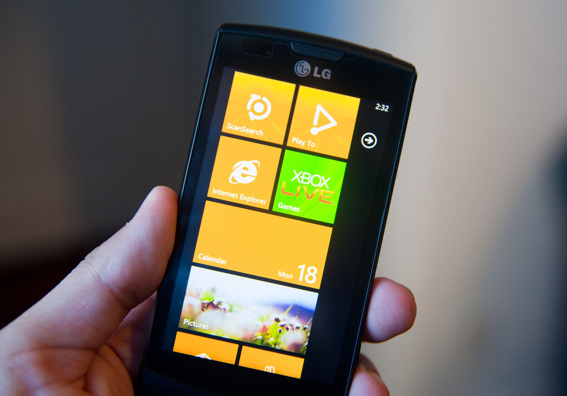
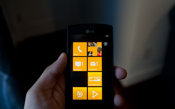
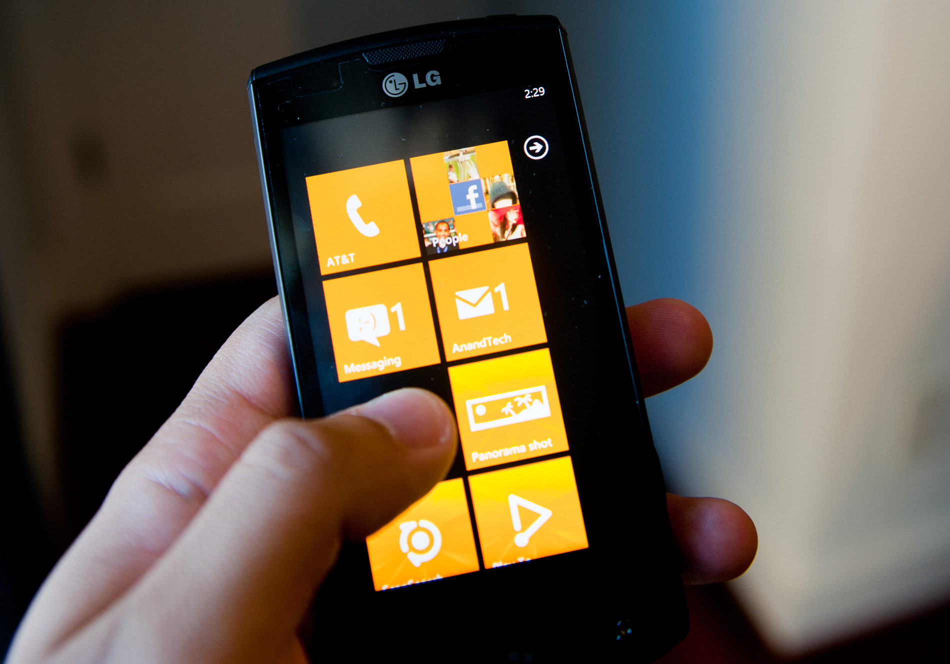
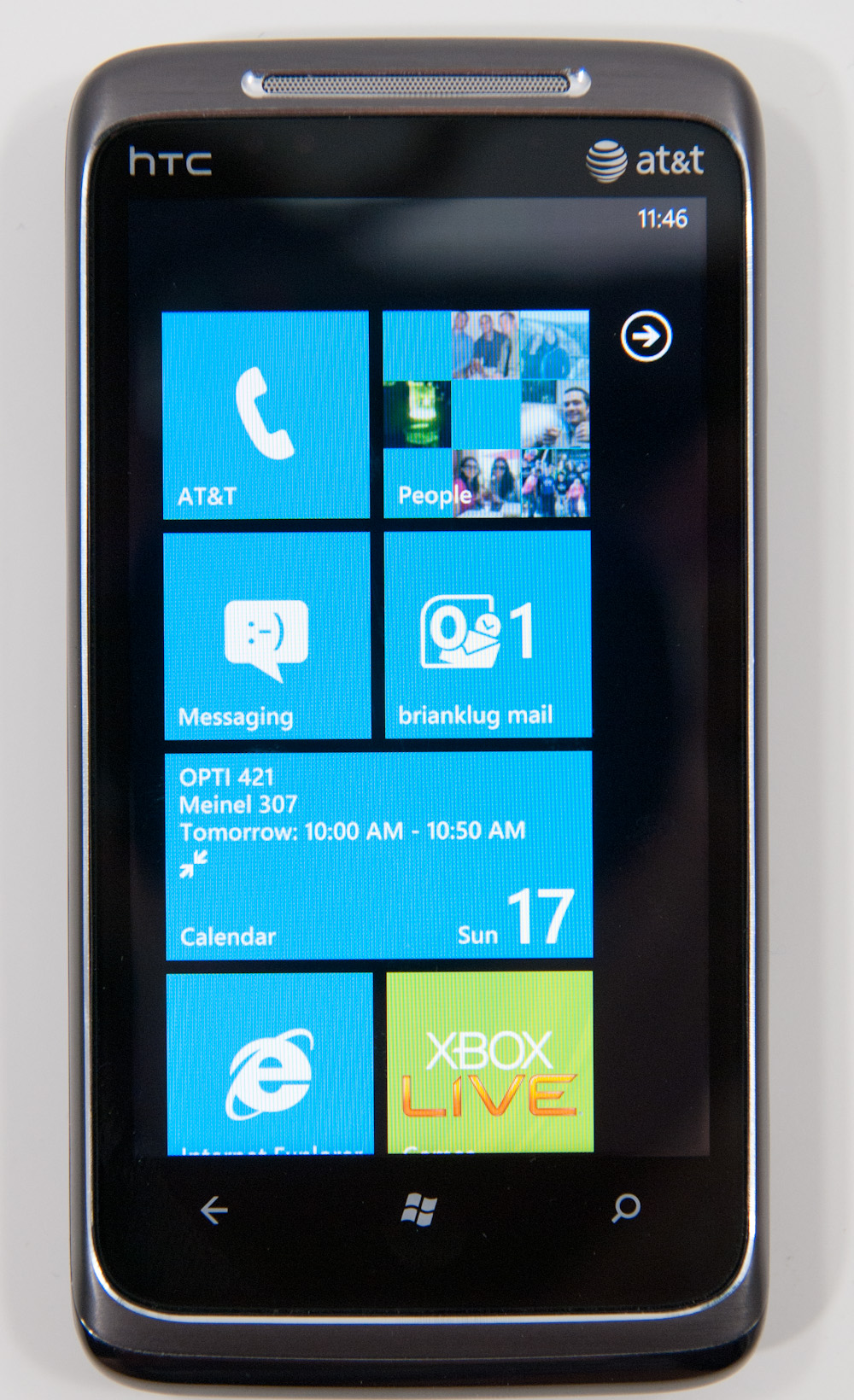
Microsoft calls it the Start screen. It’s a two page screen. The first page has a collection of square and rectangular tiles. These can be links to applications, web pages or even Bing Maps directions. The tiles can also link to Hubs, which are collections of applications and data under a common genre (e.g. the Xbox Live Hub is where you’ll find all of your games).
By default, the first four tiles are the same on all Windows Phones: Phone, People, Messaging and Email.
The next four are open for carrier customization. Carriers/OEMs can choose to populate as many of the next four as they’d like. While Microsoft won’t enforce a clean install on every Windows Phone, it does ensure that anything your carrier/OEM installs on top of the OS can be uninstalled. My Samsung Focus for example came with a bunch of AT&T apps. Not only can they be unpinned from the start menu, they can also be completely uninstalled. Carriers get the option to differentiate, but users get the option to say no, it’s a win-win situation. If you do a factory reset of your phone however, it will restore the phone to its original state - which will include reinstalling carrier/OEM installed apps.
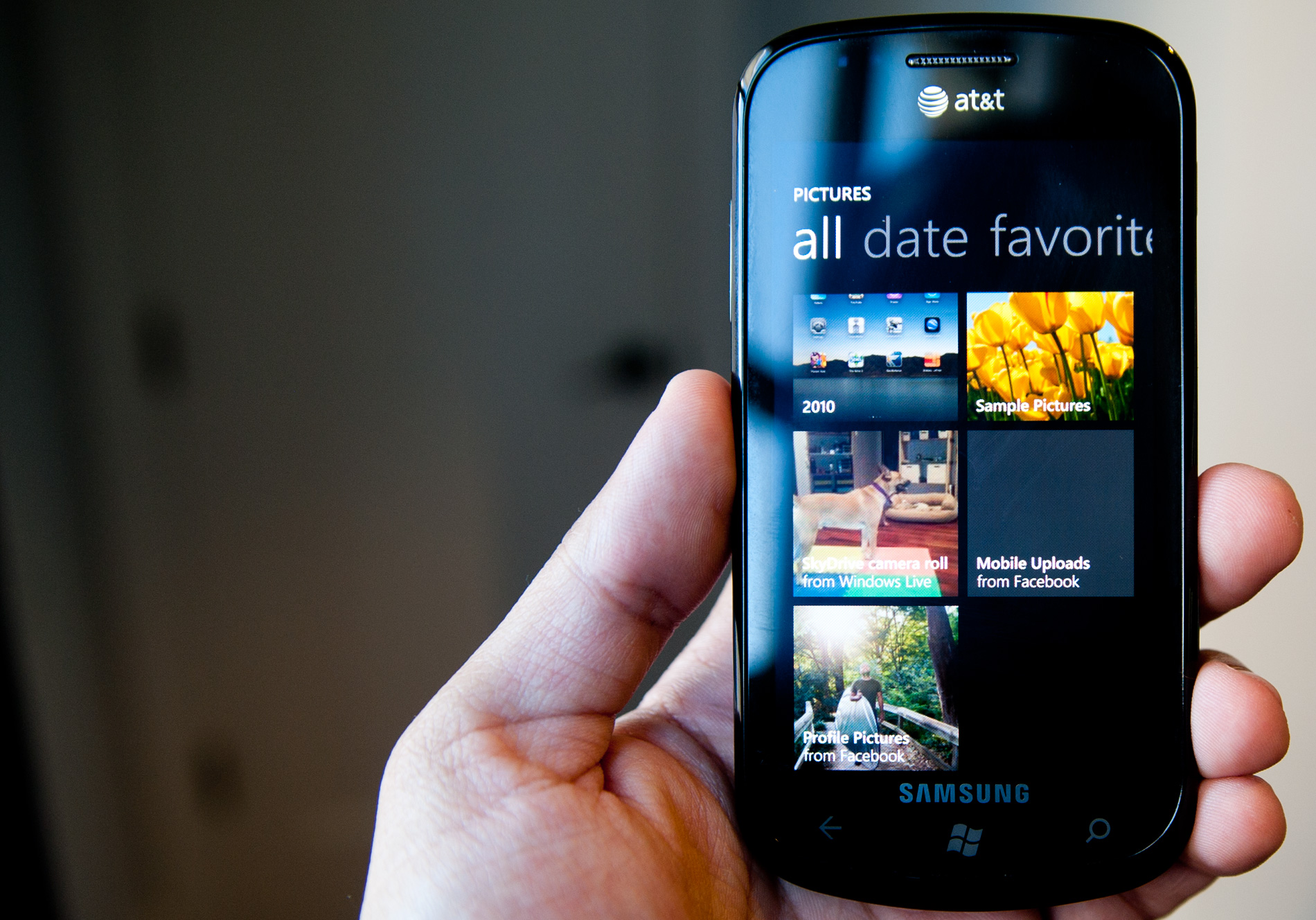
An example of an OEM installed app

...and the list of AT&T installed apps on the Samsung Focus
The start screen is completely customizable. You can change the order of the tiles and remove any or all of them if you’d like. I found Microsoft’s start screen to be more useful than the default home screen on both Android or iOS. There’s less clutter and more of what you use most frequently is front and center. It’s like the left hand side of your Start Menu in Windows, except instead of automatically populating based on frequency of use it’s static. I suppose at some point we might see a more dynamic Start screen in Windows Phone. The only complaint I really have is that the camera tile isn’t there by default, but a quick pin later and all is well with the world.

The Windows Phone UI is built primarily to be used in portrait mode. While many apps will rotate to landscape, the intended use is in portrait. To deal with the obvious width limitations of a portrait phone, Microsoft made it very clear that nearly every app is wider than a single screen. While Android and iOS treat each screen as a discrete page, Windows Phone gives you a little preview of the next page to help convey the wider-than-visible UI. As far as how it works, the experience couldn’t be more natural. Virtually all apps implement this wide UI, including the start screen.
 |
 |
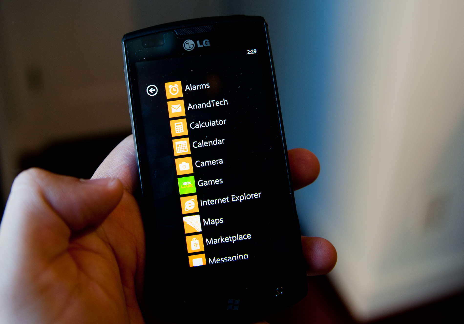 |
The start screen is the most traditional of multi-page UIs in Windows Phone. There’s a little animated arrow in the top right telling you that there’s more to be found at the next screen. Tap the arrow or flip the page and you’ll get to the second page of the Start screen: a list of all of your apps on the phone. There’s nothing more to it, just a simple list of everything on the phone. The GPU accelerated UI makes scrolling through the list super fast and smooth. And to be honest, a list of apps in alphabetical order is a lot simpler to navigate through than pages of app icons. I suppose eventually Microsoft may have to introduce another organization element to the app list (nested folders anybody?), but for now it works well.


125 Comments
View All Comments
Hrel - Friday, December 3, 2010 - link
Am I the only one who sees that the "brown" option for the UI color is red? Am I losing my sight? My tv is adjusted perfectly to THX standards. All the other colors look right. Or is it just the camera you used to take the shot?Hrel - Saturday, December 4, 2010 - link
As far as I'm concerned any phone that doesn't have a "fine me" feature with the ability to lock it doesn't even exist. Seriously, why has it taken SOOO long to have this? It should be standard on all phones. Now I want to be able to make my phone the key for my car.Hrel - Sunday, December 5, 2010 - link
I'm the same as your dad. I mean I want to view everything is the proper aspect ratio; but I also REALLY want usefull pixels filling the whole screen. That's why I wish everything was just filmed in 16:9. I mean, that's plenty wide. When I want movies on DVD I just zoom in once so the whole screen is filled and with the exception of far right/left text in some movies I honestly don't miss out on anything. It doesn't cut off very much on the sides and really when you're filming who's gonna point the camera so where you're supposed to be looking is at the edge of view? No one. 16:9 is the only aspect ratio visual media should be in. That way everything is uniform and just fits.Hrel - Sunday, December 5, 2010 - link
ie no trade offsnatewaddoups - Friday, December 23, 2011 - link
The article mentioned the confusing behavior of IE's back button... The confusion starts when you open IE from the start menu, because at that point IE throws away your browsing history, so that the back-button will return you to the start menu. It makes sense if you were opening IE to look at a new web page, but it's maddening if you were opening IE to resume a browsing session that had useful stuff in the web navigation history.The workaround is to switch to IE by holding down the back-button and selecting IE from the list of running apps. That opens IE without throwing away your browsing history, so that the back-button continues to work for web navigation.
I actually removed the IE tile from the start menu, just to prevent myself from accidentally throwing out the browser history. I've always got two or three tabs open in IE, with meaningful history in each tab, so it was always aggravating to press the back button and get kicked back to the start menu.
If you'd like to see this fixed in a future version of Windows Phone, please vote for it here:
http://windowsphone.uservoice.com/forums/101801-fe...