The Windows Phone 7 Review
by Anand Lal Shimpi & Brian Klug on October 20, 2010 7:00 PM EST- Posted in
- Smartphones
- Windows Phone 7
- Microsoft
- Mobile
Embarrassingly Smooth
Microsoft developed the Windows Phone 7 UI under the codename Metro. It’s supposed to represent the sort of simple chic design you’d find popular in a big city. If Windows Phone 7 is Metro, Windows Mobile 6 was probably suburban. A more accurate codename for the UI would have to be Liquid - there’s just no other way to describe the interface other than fluid.
There are two dominant UI elements spread throughout Windows Phone: the tile and tappable text.
Tappable text is exactly what it sounds like and the OS is littered with examples. Even conventional tabs are nothing more than oversized text in Microsoft’s Segoe UI light font.
The tabs are incredibly useful in Windows Phone, I’d say just as useful as the first time we got tabs in desktop OSes. In the email app for example there’s a tab for viewing only unread messages. To get to that tab, just swipe to the left. Microsoft calls this "pivoting." You even get a preview of the tab before you swipe to it thanks to Microsoft’s wider-than-a-single-screen interface.
Windows Phone tabs are used extensively in other applications. The Music app uses tabs to switch between what’s currently playing and all of your sources of music. The Videos app uses them to sort between different types of videos (e.g. personal vs. movies or TV shows). Apple and Google use tabs in their smartphone OSes but they’re more traditional. Your finger tends to hover around content, and swiping an entire screen to get to the next tab is just quicker than repositioning your finger at the top or bottom of the screen to tap a button. Switching between tabs in Windows Phone just feels more fluid than in the Apple and Google offerings.
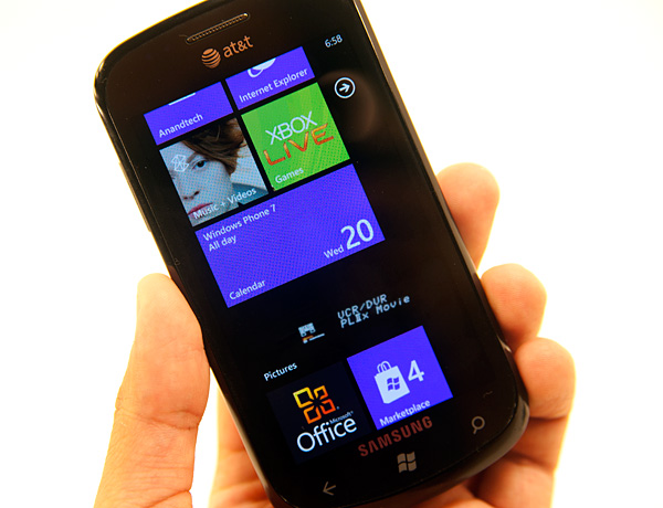
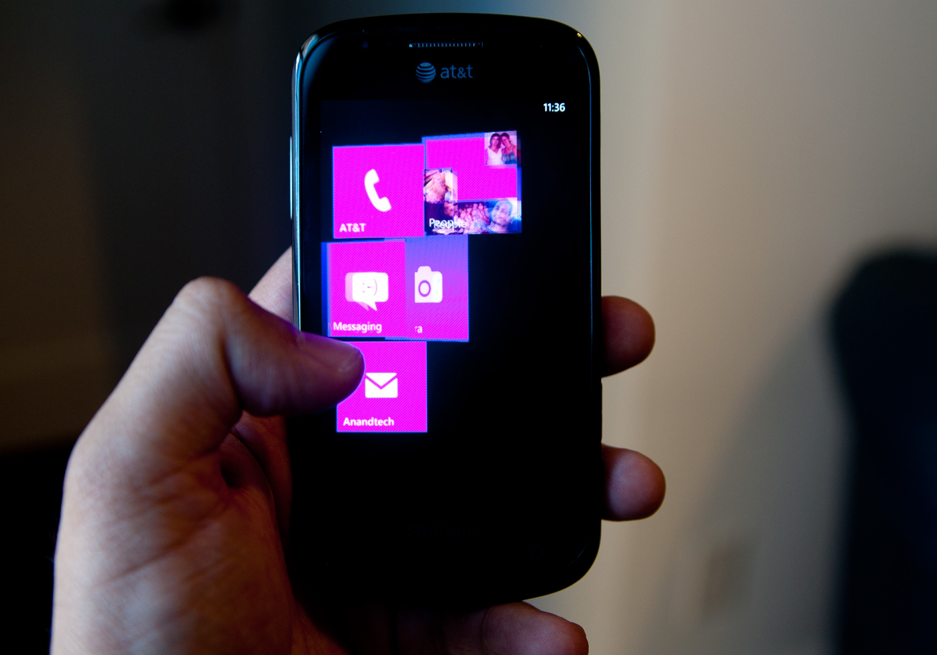
The second basic UI element in Windows Phone 7 is the tile. At least on the Start screen, a tile is nothing more than a giant, optionally animated icon. Tiles can either be square or what Microsoft likes to call a double wide, effectively two tiles placed next to each other.
The default tile is composed of a simple white symbol (e.g. a phone, a camera or an IE logo) and a single line of text.
There’s a fine line between a text heavy UI and navigating through a book. Microsoft stays on the right side of that line by making extensive use of color and animation. Most screens are static when you’re looking at them, but start interacting with the screen and the OS subtly updates various parts of the screen to keep everything lively.
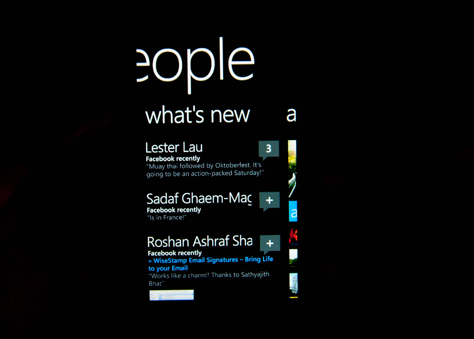
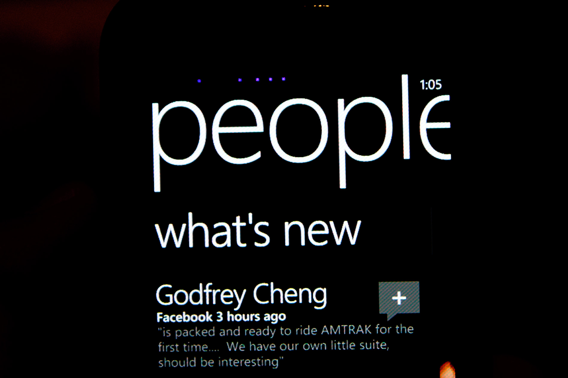
Assuming you’ve synced your contacts and/or provided a Facebook account, the People tile will display mini profile pictures of your friends. The OS automatically cycles through your friends and you don’t have to do anything to customize it, it just keeps things fresh.
The same is true for the Pictures doublewide. Your actual photos will cycle in here. The Music + Videos tile will display a photo of whatever artist you just listened to.
The UI is also functional. The Calendar doublewide gives you a listing of your appointments for the current day. Tiles for email, phone and the marketplace spawn counters to tell you how many new items (e.g. emails, missed calls/voicemails) lay within.
Animations are spread heavily throughout the OS and virtually all of them are GPU accelerated.
Windows Phone 7 runs two threads in parallel related to the UI: the render thread and the UI thread. The former preps the current frame for rendering and the latter predominantly handles user input. Most manipulation of objects, animation and transitions is handled by the GPU. In fact, Microsoft seems to have recognized the performance deficit on current ARMv7 processors and shifted most of the performance burden to the GPU.
The entire OS only supports a single GPU at this point: Qualcomm’s Adreno 200. Eventually we’ll see support for the 205 and other GPUs, but today, that’s all Microsoft supports. It’s an important limitation because it ensures that all Windows Phone 7 devices, regardless of vendor, have a fully GPU accelerated UI. While Qualcomm’s Adreno 200 GPU isn’t exactly fast, it’s fast enough to run all of the OS UI animations at a constant 60 fps.
Start screen flying out, mid animation
The GPU is put to constant use in animating everything from moving around within an app to launching the app itself. Apps don’t just appear, they fold in. Tap anything pinned to your Start screen and the tiles will quickly fly, piece by piece. The app/hub you tapped on will fly in with similar pomp and circumstance. Even within an app, switching between tabs is an extremely smooth affair. The Start screen animation occasionally feels like it takes too long, but for the most part it’s a non issue.
The high frame rate animations and the absence of any dropped frames makes Windows Phone feel very fast (at times even faster than iOS). It also makes any occasional choppiness or slowdown from downloaded apps very frustrating.
For the most part the UI never slows down, but once you start downloading apps from the Marketplace all bets are off. Many of the 3rd party apps and even Microsoft’s own Xbox Live Extras app drop frames like there’s no tomorrow. That’s the biggest concern I have for the initial wave of apps: they won’t be tuned for performance as much as the apps you get with the phone. The core OS is so fast you assume the rest of the WP7 world will be the same. Ultimately as performance agnostic as Microsoft has tried to make Windows Phone, you will eventually run into UI slowdowns - just not with the Microsoft apps that come with the phone.
Progress bars echo the UI’s minimalist design. You get five animated dots that fly by the top of the screen when you’re waiting for network response (e.g. loading pages in the Marketplace).

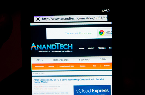
All of the progress bars animate smoothly and seemingly linearly, which helps make the phone feel fast even when it’s taking a long time to do something. This is made most evident while loading web pages in IE mobile.
The overall UI is very well thought out. It’s clean, attractive and performant. It’s easily the best UI Microsoft has ever created and one that I hope inspires revolutionary designs within the company’s other business units.


125 Comments
View All Comments
Shadowmaster625 - Friday, October 22, 2010 - link
It cant play avi files? What do you call a $500 device that cant play avi files? FAIL.beefnot - Friday, October 22, 2010 - link
I'm so sick of seeing "fail" in user comments. 99% of the time, it follows a point or points being made that wouldn't have swayed them to deem it worthy anyway. YAWN.mutatio - Friday, October 22, 2010 - link
I'm glad you guys found it to be as smooth and useful as you did. Based on what you described and the corresponding pictures, however, I'm having a hard time understanding something "just works" when the UI looks like a crap sandwich and almost makes my eyes bleed. "No, we don't use those oh-so-80's icons that graphically represent what the App does. We're much too posh for that, minimalist traffic signs for everything! Brilliant!" Maybe it'll be different with hands on, but it looks like MS went out of their way to try and make this thing look clever and almost abstract. Think myspace made into a smartphone, and if you're like me and think that myspace pages more often look like pop culture chewed up, swallowed, and thrown up onto a web page, then you get where I'm coming from. If that is the case when I get my hands on one of these, I can't see how MS can get any significant traction in the smartphone market. They might get some young emo hipsters who dig the abstract layout, but the appeal thus far of iOS and Android is the overall ease of use. My impression from your review, despite your reassurances, is that MS has again made a product much more complicated than it needs to be. I hope for MS' sake that is not the case when actually using the phone.MacGyver85 - Saturday, October 23, 2010 - link
You'll just have to try it to appreciate it I guess.I can understand people when they say the interface looks bland or overly simplistic based on "screenshots" of the UI. But when you see it in person it's so much better. Really.
Likewise with how you navigate around it. It's just so intuitive you don't for a second have to think how to do something. Every time someone asks me if what it's like I always respond that they'll have to use it themselves. And everyone that does loves it. Seriously :)
Dare I use it but what the hell: it just works!
DJJoeJoe - Saturday, October 23, 2010 - link
I don't think any OS at this point can grab a drastic number of market share like we see in the phone space obviously, or even the slightly slower moving browser space. Modern Operating Systems are so mature at this point that there is really little you can do, both Win7 and Snow Leopard were just small refinements to their previous versions.I think it's doubtful that even something as force-ably drastic as Chrome OS will do anything to the landscape either, even if Google bucketed down and really nailed it. Sadly the market share is ruled by the people going to costco and grabbing up a pre made pc, or large corps running xp, and I can't see something drastic being sold to either groups in the next handful of years.
tis all in the phones these days, and I wish I had a time machine so I could get the second wave of hopefully nicer wp7 handsets and maybe a good update to the os itself. Don't got the money to spend on a 'amazing start'.
Sabresiberian - Monday, October 25, 2010 - link
Looks to me like Vista's bad press helped Apple reach 9% market share, but that's as far as they've moved up. Win 7 is sweet and everyone knows it so Apple is no longer making headway.I don't want Microsoft execs to think that way though - like was written in the article, I think Microsoft performs better as an underdog, and if they think more in terms of being threatened by Apple or someone else then perhaps they'll be more inclined to put a shining example of what they can do out on the market.
Glad to see Microsoft did produce a product with some shine.
;)
dotroy - Thursday, October 28, 2010 - link
Windows 7 phone is good ...umm ..some things not as good ..but win7 phone is good, there are somethings done better by others OS but win 7 phone is good. I never felt like this before. This is a paid advertising. Anand is making good money.pete2s - Thursday, October 28, 2010 - link
Will Windows 7 Phone store apps on the ROM partition? If so, this severely limits the number and size of apps as well as their quality.Although Android is evolving past this limitation, Android, Blackberry and Palm phones store the OS and all apps on an encrypted partition referred to in the specs as the ROM. Usually, this ROM is 512MB. After the OS is installed, the phone has less than 300MB for apps.
Initially, I thought Windows 7 Phone would not store apps on the ROM because of its unified storage system that creates a single volume. If this were the case, however, there'd be no point in having a larger ROM because the ROM would only be holding the OS + the 60MB limit of pre-installed software. Some phones, like the Samsung Focus, do have larger ROMs though (1GB compared to 512MB). The only point of having a larger ROM would be to store more apps because apps are installed to the ROM.
If the above is true, Windows 7 Phone will be severely limited in app size and thus development.
drwho9437 - Monday, November 1, 2010 - link
"It’s almost as if Microsoft is taking Apple’s approach and simply letting everyone build iPhones."Exactly and it is genius, it means the cost margin will vanish and the experience will still be as the software people want, people won't think poorly of these phones just because of a few badly designed devices they used. Let's hope it works out.
owbert - Monday, November 1, 2010 - link
best review of win7 phone amongst others. great work!